Many things I learned from sharing…

The ‘official end date’ of my residency at the London Cancer Hub was 31st January, and that day I held a ‘closing event’ at the ICR. Although to be honest, I will continue to work on these themes and use the learning from the residency in the immediate and the long term future, so it doesn’t really feel to me like the residency has come to an end!

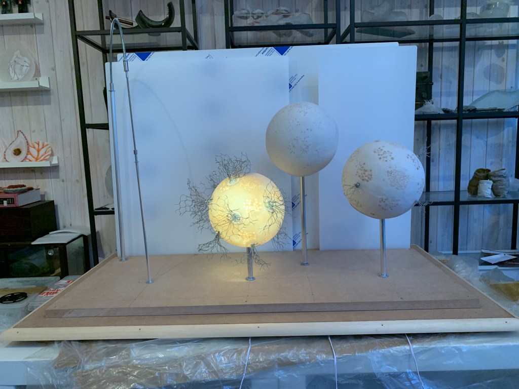
There were multiple purposes to having the event. I wanted the opportunity to share back about how the residency had progressed with those who had contributed, to let them see the tools that I had used to make sense of the experience and to show them some of the prototypes and the samples that I had created as part of the work. I also wanted to introduce others at the ICR (and potentially across the LCH) to the residency as obviously not everyone had come across me or my research. The location near the ICR reception and cafe would help with that. And finally, it would be a great chance for me to gather feedback from people seeing this work for the first time.

I was delighted that I was able to do all three things. During the course of the event, which lasted about 4 hours, around 50 people stopped to look at the work and to talk, and many more wandered by. I had surprisingly in depth conversations with about 30 people. It was really fascinating to be able to gauge and discuss people’s reaction to the work and the process. I also found out more about some research and support roles at the ICR that I hadn’t known about before. 

Below I have summarised some of the things that struck me from the many conversations I had with people visiting my work.

Representational vs metaphorical vs something else?

One very interesting strand of conversation was about how far the pieces were intended directly to represent the processes of a specific element of the cancer ecosystem. I talked about how, from my perspective, I have drawn out ideas, themes and metaphors from the discussions I have had, that I have experimented with these ideas and themes in different ways, but that I am not aiming to illustrate scientific processes.

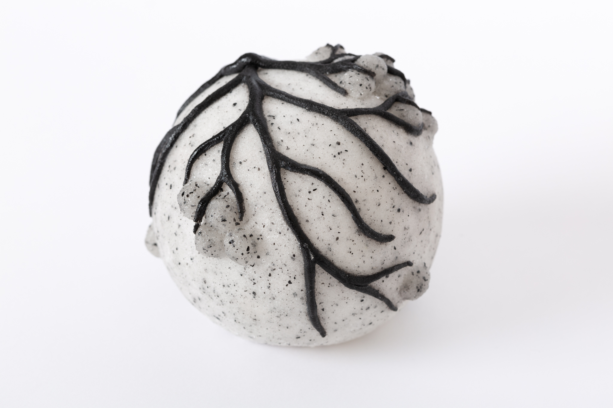
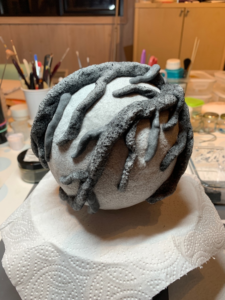
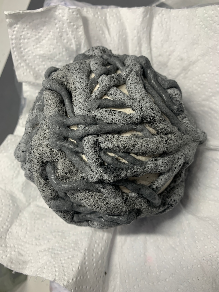
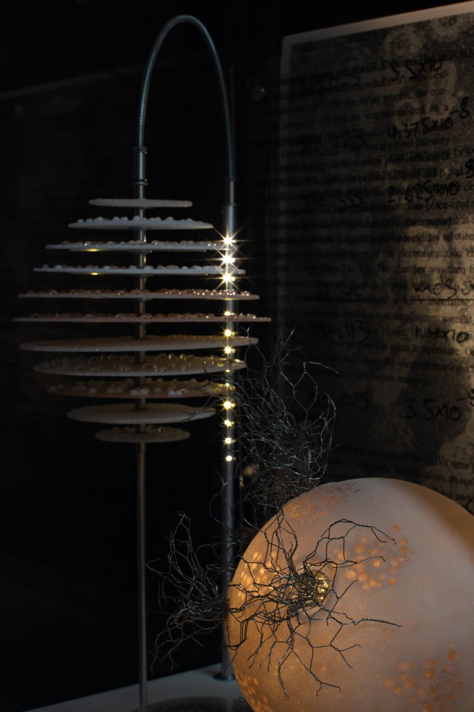
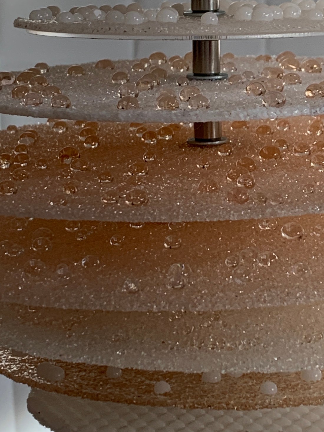
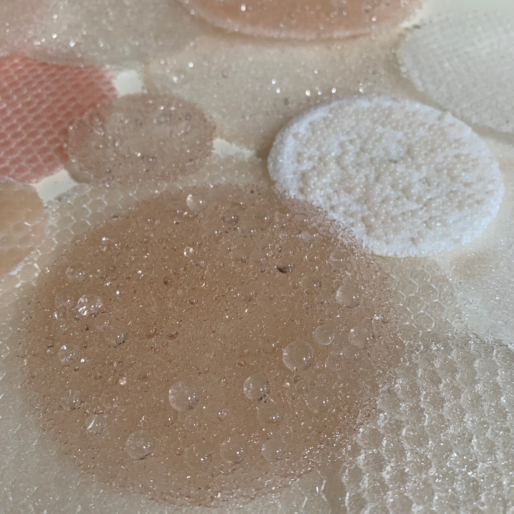
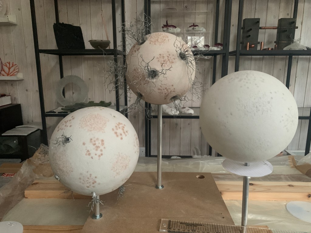
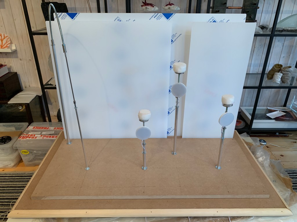
Several people asked me what the base sphere structures represented. I explained that I think of them as potentially being any of: abstracted cells, abstracted tumours or abstracted bodies. I also observed that spheres are often the starting point for my work. I ended up in an interesting conversation about how organoids look (organoids are structures grown in the lab that have some characteristics of real organs and are therefore useful as an alternative to plain medium), and concluded these pieces could also represent abstracted organoids. To me it feels quite important that they could be any of these simultaneously and are are not specifically one thing or another. I like the idea that people can take meaning from them in a way that makes most sense to them. 

Another conversation about how far the work was representational centred on my choice of black for some of the dendritic patterns and the ‘cells’ themselves. I said that I had been inspired by the convention around extreme hypoxia being very dark or black. I was challenged about this in relation to the fact that the vessel growth, being on the outside of the structure, would surely be red (highly oxygenated) not black. My position was – and is – that I am not creating something literal, and that, even if i decided to do that, these samples were anyway potentially components and I was unclear at this point whether they could be inside another structure or how they would be grouped. And, of course, the structures themselves, despite the fact that I sometimes refer to them as cells, are not in any case determined (see above), and therefore it is impossible to be ‘accurate’ about a representation. 

This whole conversation confirmed categorically for me that for me this work is not intended to be representational of any specific scientific process or entity and that the pieces are not designed to be illustrative or ‘correct’, Instead my aim is to draw on ideas, present them visually in different ways to stumulate thought and questioning. And whilst maybe I will convey some of my intention and thought process through the pieces, I also want to allow people to interpret the pieces according to their own experiences. I am mindful, for example, that some of my inspiration comes from patients as well as scientists, and that I have deliberately been pursuing their subjective and highly individual imaginations to inform our conversation. However, I need to keep in mind is how far the pieces – in their context of the cancer ecosystem – may be taken as if they are representational and what this might mean for how they develop and are displayed.

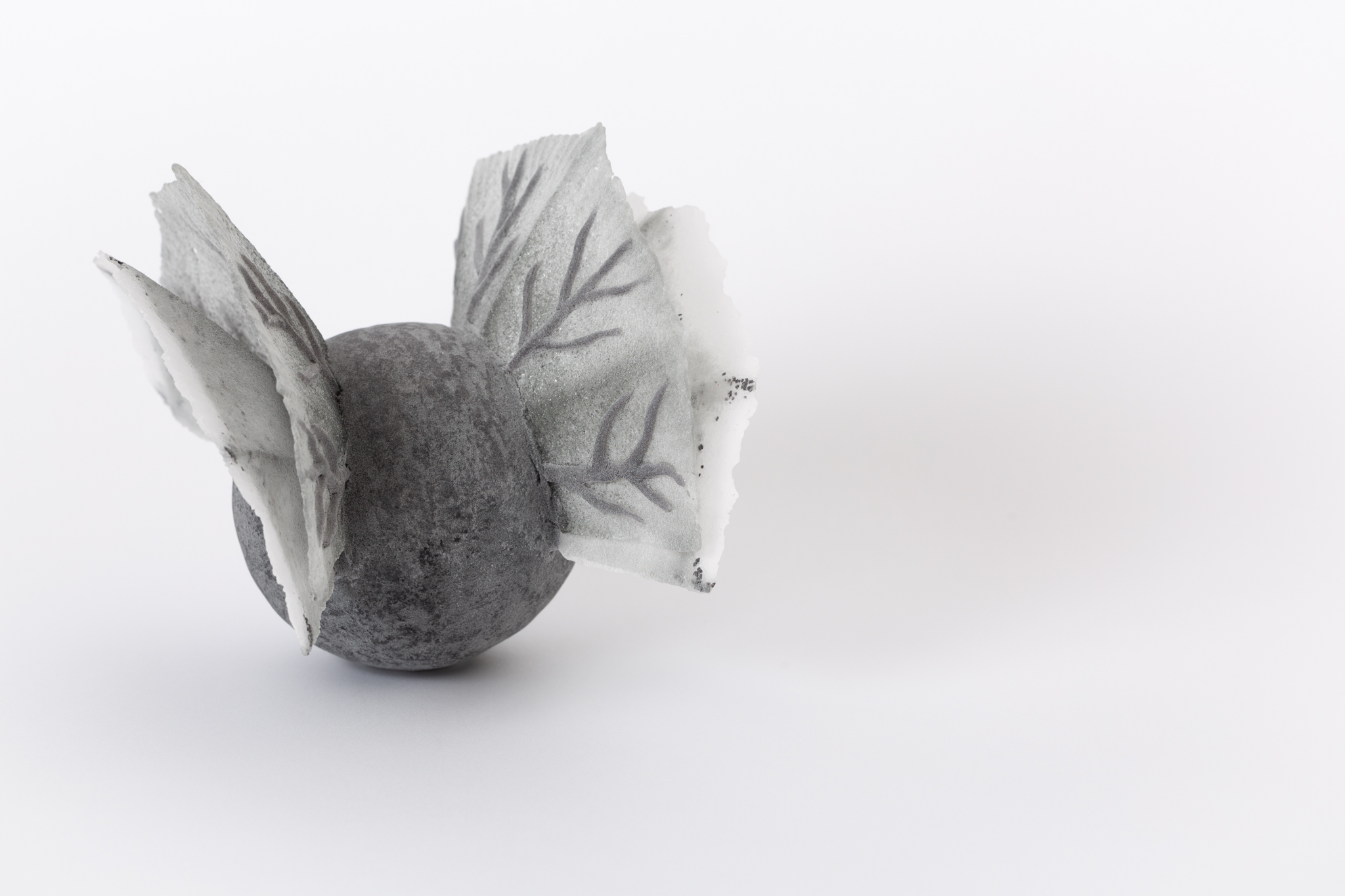
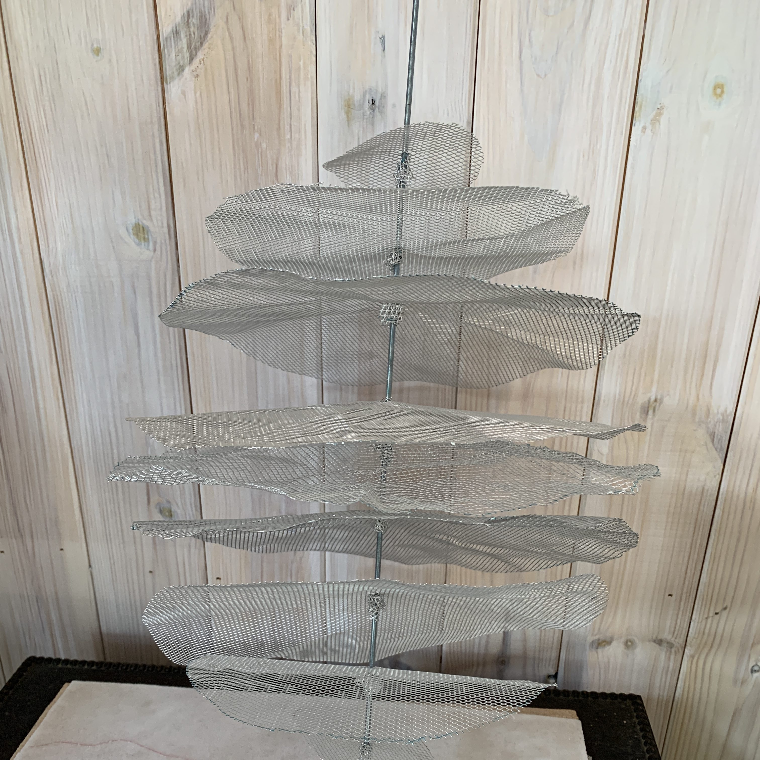
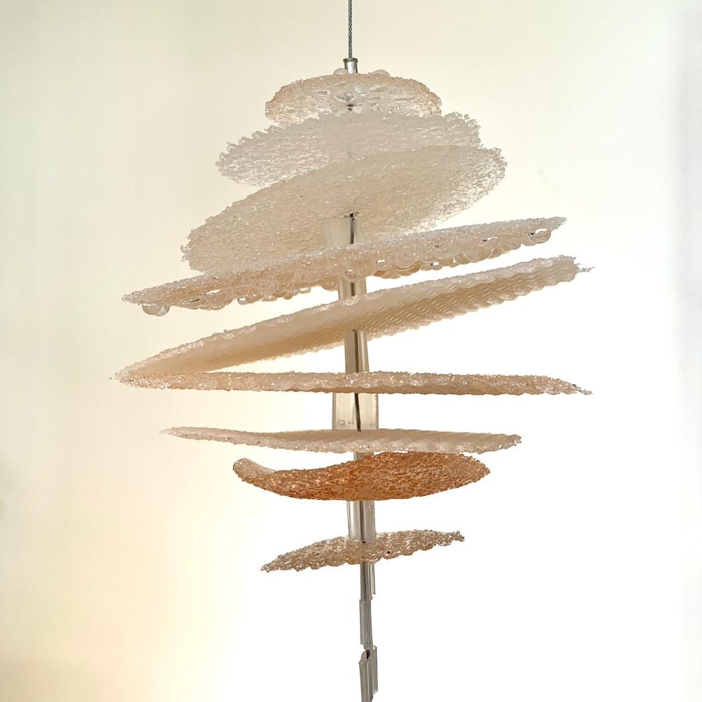
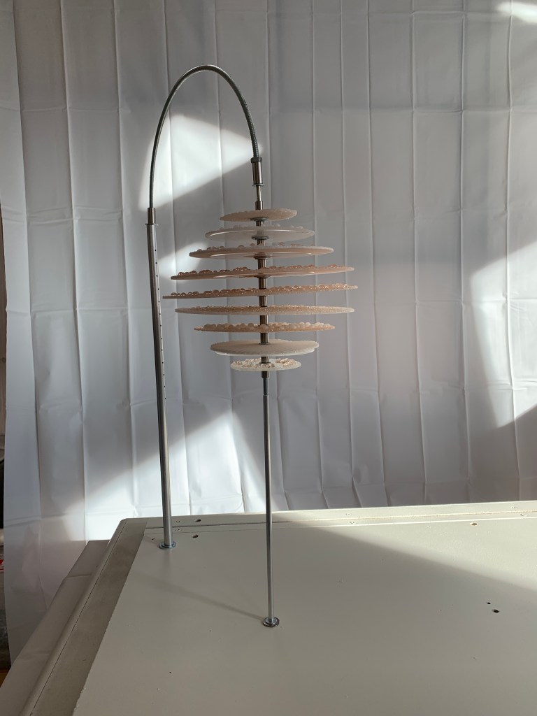
I was also asked about the Winged Thing and whether and how the metaphor might be explained. Would I have a caption or a label if I was exhibiting this in another context? I am to some extent undecided on that, and the context would itself be key. These pieces a) are prototypes and b) might be used as part of a composition and c) may yet change signficantly in their final incarnation, and with these factors in play, that is not a decision I can take at this point. However, I do think that if I want people to understand the metaphor specifically as mechanism of cancer then an explanation either as part of the artwork or explaining the artwork alongside would need to be a consideration.

Cultural references

I was surprised that several people referenced films when describing how they thought about some of the pieces. Star Wars and also Harry Potter’s Quidditch ball came up when talking about the Winged Thing. Spider Man and his black suit in Spider Man 3 came up in relation to the ‘tar’ overgrowth piece, particularly in connection with the idea of being gripped by something you can’t get out of.

Aesthetic and/or emotional impact

One of the things I was particularly interested in getting feedback on was whether these pieces created any emotional impact. Sometimes this came up spontaneously in conversation, and other times I raised the question of how people felt when looking at them as part of a discussion.

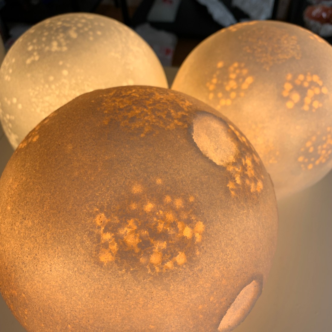
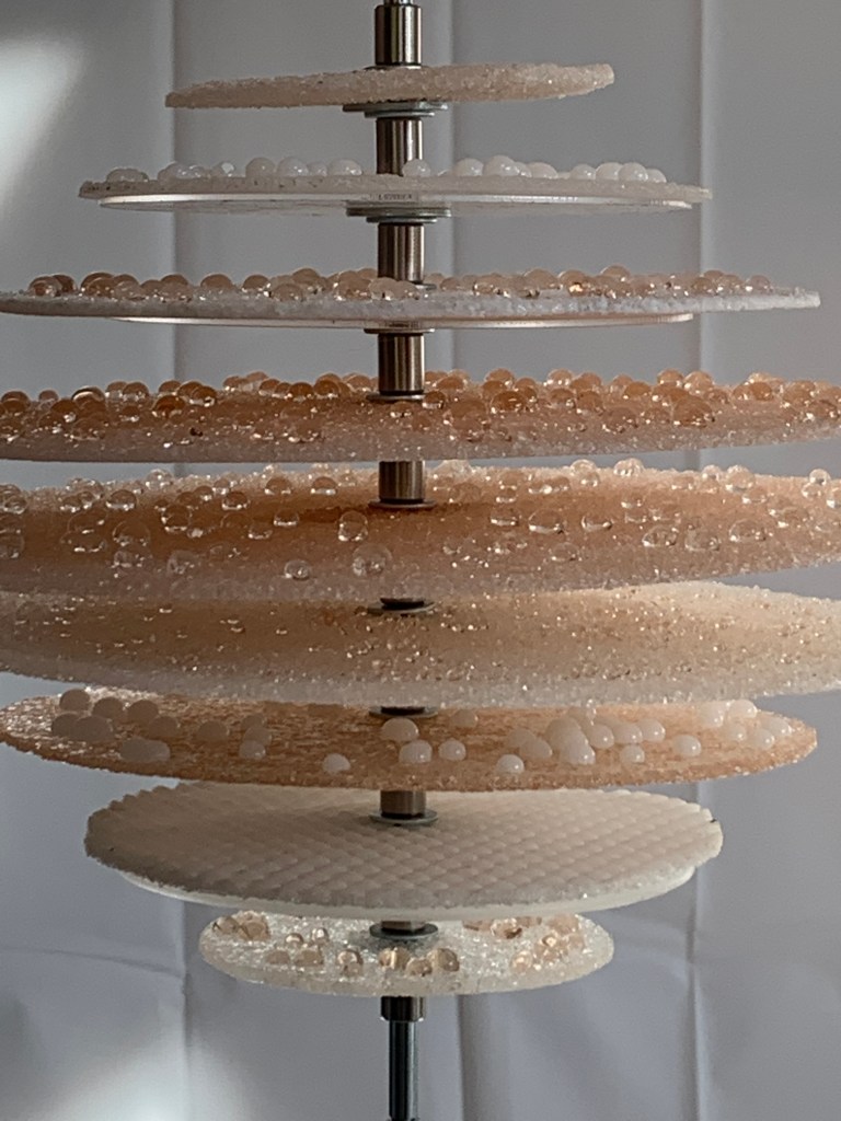
It seems to be having taken stock, there were a wide variety of responses. A couple of people said that they appreciated them aesthetically but did not have any particular emotional reaction. Several times people reacted to the largest dark piece and the tiny black piece by finding them ‘menacing’, or ‘threatening’, or ‘sinister’. These reactions mirrored the response I got from the Art for Social Change artists too, with whom i had previously shared some images; some people found them quite ‘shivery’ whereas others are unmoved. Very interesting. 

One reaction I had was from a PhD student studying pathways in sarcoma. He said that he found one of the pale pieces much more sinister than the dark ones, as the growth around the outside was much harder to differentiate from the body of the piece – from his perspective, cancer is like that – hard to discover, hard to separate from the body, stealthy. We talked about how cancer is so much part of you, and I resolved to think about this more going forward as it chimes with my feelings about how cancer is intimately part of one’s own makeup and particular to you as an individual.

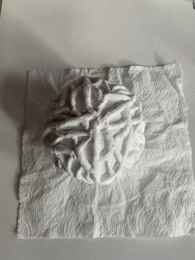
Also as part of the exhibit, I had prepared an exercise with ‘lace’ or ‘lattice’ piece. I asked people to jot down a word or two about what they thought when they looked at it, vs what they felt. Here is the outcome of some people’s contributions. An interesting mix and once again food for thought.

Colour palette

Many many of my visitors asked me why I had chosen the monochrome palette that I did for these pieces, and I explained as above that the starting point had been hypoxia. However, I got a strong feeling that people would be interested to see these or similar pieces with some colour. It set me thinking about whether I would too. Perhaps the next iteration will feature some other tones?

Two ecosystems side by side?

One of the more complicated things I ended up reflecting on as a result of the conversations I had about the project was the ‘success’ or otherwise of looking at these two ‘ecosystems’ side by side. This is something I have been wrestling with throughout the project and talked about in my research interviews also. At this event, I was challenged about whether the LCH could really be considered to be an ecosystem in any way beyond the fact that anything on earth could be considered an ecosystem. Wasn’t it just, like most things these days, an example of a network rather than an ecosystem? 

On this point I would argue that the LCH in fact is more of an ecosystem than, say, a network of aeroplane routes. The LCH is an example of a social system that is developing in an environment, where different groups of people react and change as a result of their interactions with each other and their environment. Some gain useful resources, make interesting connections and thrive, others don’t. In my view this can happen both in organisational and individual levels. So from my perspective, the metaphor of an ecosystem is a useful one to understand how the LCH might function and develop, and that is a matter of importance to those who believe that bringing the London Cancer Hub together is more than a set of buildings on a site and potentially could provide opportunities to collaborate more or better with the goal of preventing and treating cancer. 

At the event, I explained to people that a central question for me was to understand what could be learned from the exercise both from comparing and contrasting the ‘ecosystems’, and also as to how the two different systems might each have a place in the resulting artwork. I am coming to the position that ideas from the cancer ecosystem can be used quite successfully to interrogate the state of play with the London Cancer Hub but not necessarily vice versa. Using the ecosystem metaphor allows one to approach the idea of bringing organisations together in a system from different perspectives and ask new questions. What are the pathways, signals, and structures that are being created? Where are the areas of toxicity? How far do those work in a similar way to the biological systems? I am sure one can use these questions to help continue towards developing the LCH as a healthy, constructive and creative place to work together. However, it is much harder to see how contrasting the two systems works the other way around, using metaphors from the LCH to inform the research into the cancer ecosystem. And, to be honest, I am not sure I set out asking the relevant questions about how the LCH functions tso that one could apply the metaphors from the organisational, social and spatial environment of the LCH to see the cancer ecosystem differently. This is all part of the learning for me, and something I can set my mind to, going forward.

This event brought the formal part of my residency to an end, and in terms of this blog, it only remains to draw some of these ideas together in my next and last post on this project.

Collected images of the artwork prototypes

As the residency draws to a close, it’s a good time to share images of some of the prototypes and samples that I created alongside undertaking my other research. I always like to document my work and also to be in a position to provide high quality images where necessary, and I can’t do that with the snaps that I take myself. So instead I rely on my wonderful photographer and friend Robyn Manning. Before finishing the residency I took some of the samples and prototypes over to her studio to photograph, and here are the results.

Other kinds of maps

Towards the end of the residency, one of the things I wanted to do was to share back with those who had contributed some of the process and outcomes of my time working at the London Cancer Hub. So we planned an event at the ICR to do just that.

I was finding it really complex to work out how to convey all the thinking that I’ve been doing during the residency, and then my fabulous colleague, Siobhan Kneale, who has been working with me on behalf of Sutton Council and Sutton STEAMS ahead, suggested putting together a mind map. 

I did, and it grew, and grew, and grew. Here it is in its semi-final form. It has proved an invaluable way to organise my ideas and to record my thinking. It doesn’t follow a single type of categorisation – the joy of a mindmap is that I can set creative ideas in the same context as noting ideas about the two ecologies and then branch into glass techniques and technical exploration. It is very much a personal record rather than any form of analytic, and highlights not everything I learned but those things that stuck out to me.

I also put together a map of metaphors according to how closely I found them to apply to the London Cancer Hub, the Cancer Ecosystem or both. Not a scientific process, more a finger in the air type of approach, but it will be useful to me nonetheless in capturing my thinking and shaping potential artwork.

I prepared prints of both of these for the Closing Event to share with participants and anyone else who might be interested…

Things with wings

When thinking about all the metaphors and how my artwork might develop I was immediately struck by the metaphor of cancer cells developing ‘wings’ as they transition from single tumours to metastatic disease. I knew it would be technically challenging making a piece in glass that reflected to any degree what I was visualising in my mind’s eye, but I thought I should try and at least capture something of the feeling by ‘going for it’ and seeing what I could achieve.

To understand the challenge, it’s necessary to share a little about how glass behaves when it’s heated. To make my pieces in ‘pate de verre’ (literally paste of glass), i make a paste from crushed glass or glass powder and apply it to a mould. This is the process you can track looking at my previous post about making ‘cells’. When the glass is then heated in a kiln, the powder or crushed glass fuses together in the heat to make a single surface. What holds it in position is a delicate balance between the level of heat and the structure of the mould. Too much heat and it will drop off the mould, too little and it won’t fuse and will return to dust.

When trying to create ‘wings’, if they are freestanding, they will sag in the heat and eventually drop onto the nearest surface, which might be the body of the cell or might be the shelf of the kiln. Luckily, earlier in the year I had learned a firing technique of firing pieces in a bowl of powder (sand or aluminium oxide) which could support the wings while the glass fused. For this i am grateful to the amazing glass artist Saman Kalantari. Here an image of some pieces I created by combining this firing technique with my own method of pate de verre.

However, what I wanted to achieve with this project was more ambitious technically in terms of the scale and form of the wings in relation to the ‘body’. My initial sketch for the piece is below.

As I’m not super comfortable in two dimensions I went on to make a 3D maquette out of polystyrene and wire mesh. You can follow the whole process through the flow chart below…

THe chart makes it look relatively straightforward, but I can reveal that it was not! Getting the firing right required multiple attempts, with the piece going into the kiln in one way or another about 5 times. Luckily, I wanted the piece to look a bit ‘distressed’ as this is entirely in keeping with the ideas of the cells that emerge with ‘with wings’ from the ‘cell graveyard’ within a tumour. The cell that emerged was a bit battered from all it had been through, but proved that it is possible to make a double-winged entity where the wings have a significant area in relation to the size of the ‘body’ of the piece.

Here is an image of the piece once I had brushed it off and done a bit of coldworking - that is, finishing edges and surfaces with grinding and polishing tools.

Experimenting with angiogenesis (2)

After making the ‘cell’ structured from ‘veins’ I tried a number of different approaches to applying vein-like patterns to the exterior of a cell structure. I wanted to try degrees of visual order or chaos, and to see how these effects looked in different tones – dark veins on pale background, pale veins on pale background, dark on dark etc. I also wanted to assess impact of variations in size. So i made a selection of other ‘dendritic’ cells to compare with the initial cell described in a previous post. Here are some images of the making process for these.

And here are some images of the finished cells

I also made a small sample of a potential flat panel featuring an image of a tangle of blood vessels with gilding added, representing something of a golden thread or pathway through the tangle. I went on to make three larger sample panels which became a series of three with the gilding ‘moving through’ the vein tangle and spreading across the panel.

Panels waiting to be fired for the first time before gilding

Working with different approaches to some of the same theme has felt very productive for me. I have got to assess creatively and technically which types of surface are most successful and most expressive. I also plan to gather some feedback from others as i begin to share the work to get a sense of what the different patterning and finishes convey to those who see them…

Finished angiogenesis text panels

Experimenting with angiogenesis (1)

I have already written about my interest in angiogenesis as a process that forms part of the cancer ecosystem and that potentially functions as a metaphor in the LCH context (see Concepts and Metaphors (5)). It has been fascinating to look at images of the blood vessels that grow to support tumour growth. and equally interesting to see how clearly related the visual qualities of blood vessels from a tumour are to growth patterns observable around the LCH site, such as amongst the trees and ivy growing near the demokition site and close to the Royal Marsden.

On the left, an image of tumour blood vessels. Centre and right, images of trees and ivy on the LCH site.

These types of images were my starting point for making some glass samples and experimenting with using dendritic growth patterns as both structure for glass cells and for decoration.

And so, angiogenesis has emerged as a focus for my initial creative exploration. I have long been interested in creating vein-like, dendritic structures and decoration, so this is an evolution rather than complete change of direction for my own creative practice.

I decided to start with the basic form of the sphere, partly because i enjoy working with that form, and partly because to me the sphere is suggestive of the shape of a cell (regardless of the fact that not all cells are spherical). 

My first idea was to try and construct the form as a whole just from ‘veins’ to see if i could form the cell structure that way. The following images track my progress along that path.

The first line of images above shows the initial ‘veins’ of glass paste that build the structure of the glass over the mould. The second line of images shows a later stage where more veins have been added and interwoven. I was aiming at an outcome that was somewhat evocative of the growth patterns in the images of the tumour blood vessels and also the tree and ivy growth.

In the kiln before firing

This is how the piece looked when it went into the kiln for firing. Glass paste shrinks considerably when it’s fired, so I was expecting the veins to be more slender when they emerged. From the technical perspective I was concerned about whether the structure would be strong enough and stable when it emerged as the shrinkage can also cause the glass to pull away and disconnect or to crack and break. From a creative perspective I wanted to see how the veins looked after firing to see if they (still) evoked the tumour and growth patterns.

This is how the finished ‘cell’ looks below with a bit of directional lighting. Luckily the firing went well and the piece emerged intact. As a sample or prototype I am very happy with how it’s turned out. It was very time consuming to make – more so than the samples of dendritic cells that i made subsequently, as the lack of underlying structure for the veins made the whole thing more complex. I also felt that the shrinkage of the glass made the piece slightly less evocative than it was pre-firing, but to some extent this could be changed in subsequent pieces.

One thing I should add at this point is that this – as a sample or prototype – is not intended to be a standalone piece. My intention was that it could be a model for a component of a composition of cells, potentially some in light, some in shadow. I knew also that I wanted to experiment with working in a pale colour, probably white, and making vein structures that were also more ordered, less chatotic. So that’s what I did next.

Welcome!

Featured

Thanks for coming to visit Glass Bodies, my blog for reflecting on and recording some of my collaborative projects about medicine and the body and how I translate my learning about these into my artworks, usually in glass (hence the name of the blog….)

If you are new to the blog, you’ll see that my most recent post comes first. This is handy for people who are coming back to read my latest updates, but if you have just arrived to read about Evolving the Ecosystem, my research and development residency at the London Cancer Hub as part of Sutton STEAMs Ahead, it will make most sense if you scroll back to September 2023 to my first post about the project and read forward from there. This residency is funded by London Borough of Sutton as part of the Mayor of London’s Cultural Impact Award and The National Lottery Heritage Fund.

Enjoy!

All Lit Up

From quite an early conversation with the team, the intention had been for the vesicles to be lit up, but what was less clear was how this was to be achieved. We had discussed how it would be great for the lighting to change throughout the day, both to compensate for the piece being placed in a position without natural light (the CRF waiting areas are not naturally lit) and also to add interest to the piece.

I liked the idea of internal lighting and a transition across the day, finding it wonderfully consistent with the idea of a traditional diorama, as these often included their own interior lighting to draw in the viewer. One of the big questions for me, though, was how to programme the timings on the lighting, not being particularly competent in that area.

I did briefly learn how to use Arduinos, but it was a while ago and I would have had to start again from scratch to make it work. Also, all the restrictions of Covid made it harder to contemplate outsourcing this part of the project, as did the available budget. The answer came in the surprising form of aquarium controllers. These controllers are designed to make sure that aquarium fish are not shocked by the sudden switching on of the lights in the morning or the switching off in the evening and allow you to programme a series of sunrises and sunsets across the day.

Constructing the stands so that the glass elements were lit internally was initially a case of testing lots of different types of 12V lights of the kind often used for caravans or countertops. Eventually I found some that I was happy with and set about mounting them so that the lights would be correctly positioned within the vesicles. Lots of cases of trial and error as I went along and once again aquarium supplies came to the rescue, this time in the form of clear flexible tubing that holds the lights in the right place.

Finally, after wiring, soldering and finishing the full construction of the piece, I could programme the lights in the vesicles. They can each be set to gradually come on at different intensities across the day to draw attention to different parts of the diorama.

Meanwhile, another challenge was to light the Z Stack. I achieved this through feeding an LED strip through the length of the stand I had created for the stack, with holes strategically drilled to let light through. For me, this layered lighting enhances the analogy of the Z Stack itself, and how the microscopy and computation processes build a whole form from slices of data.

The final lighting for the Z Stack

To see a timelapse of one lighting scheme for the finished artwork, have a look at a forthcoming post of images of the final piece!

The Z Stack

As well as the vesicles, a major glass element of the sculpture was the Z Stack, as I like to call it. This is a form made from ‘slices’ of glass, each with a different colour or texture, that when mounted together suggest a three-dimensional form.

The Z Stack was an element that came to mind very early in the process during my visit to the labs, when Arindam explained to me how the images of the ‘spheroids’ of cells were constructed. The confocal microscope could be instructed to scan multiple layers of a three dimensional object, and would then build an apparently three dimensional image from the slices it had scanned. The number of scans that go into constructing the image would then affect the resolution of the object and also the time to create as well as the ultimate file size.

A non-glass mockup of a Z Stack – my first experiment with the idea

There are two main textural types of slice in the Z Stack – those with ‘miniature vesicles’ on the surface, and those which have a honeycomb structure. The honeycomb is the one reference in the piece to the original source of the peptide, the Amazonian wasp.

I wanted to create an analogue analogy for the Z stack, to create a 3D form from slices, and from that my Z Stack was born. Initially I thought it might be interesting to make the slices ‘floppy’ to accentuate the departure of the analogue from the digital counterpart, but aesthetically I found it confusing and cumbersome. I also wondered about offsetting some of the slices from the horizontal, but again this appeared to confuse the communication of the idea.

In the later stages of construction, I continued to experiment, but this time with the number of slices to see what worked best in creating an outline form. Below is the version with 9 slices.

I ultimately settled on 11 slices as giving the most pleasing form.

Construction

Once the vesicles were underway, one of the major considerations in creating the piece was the relationship between all the different elements. I had already, obviously, committed to creating the ‘vesicles’ and ‘z-stack’ at certain sizes and imagined them situated in relation to each other, but there was still quite a lot to be considered in getting the relationships right. There was also a lot of planning and experimentation in creating the fixings to hold the glass in position.

Once I had a sense of the sizing and spacing, I set to constructing the base and the stands that would hold the glass elements. I was also trying to take into account that the piece would need to travel from my studio to the hospital in Leeds, so my aim was to make the piece so that it could be deconstructed again for transport.

Meanwhile, the case I had ordered to contain the diorama had arrived. This meant that I could make sure that all the measurements I had made were accurate and that the base and the case would fit together properly.

The slats at the back of the base would hold the acrylic sheets used to mount the backdrop images. These had to be carefully measured so they would hold the sheets firmly in place.

Eventually the base was built, and I could mount the stands that I had created to hold the glass elements and acrylic sheets. At this stage, I was working with the acrylic sheets still in their protective wrap – that only came off close to completion as acrylic scratches very easily. In fact, the case for the piece has been treated with an anti-abrasive coating to try and minimise exterior scratching, although it can’t prevent it altogether.

And now, all that was left to do was to spray paint the base and mount all the interior elements!